Let’s talk about colour theory. It sounds scary, I know, but it will massively help you on your quest to become an amazing mini painter.
The last time you ever did anything on colour theory was probably back in primary school when you learned that yellow and blue make green. Do you remember those powdered paints that you added water to? You never used a clean brush each time though, so they all came out a sludgy shade of yuck that you streaked across the paper. When it dried it had wrinkles in it because the paper was too wet and had shrunk. Well, what we’re going to talk about here is going to be much more useful.
First, some key terms that will help you with what we’re going to be talking about.
Primary Colours
Are colours that cannot be made from mixing other colours, and form the basis of all other colours. These are red, yellow, and blue.
Secondary Colours
Are colours made by mixing two primary colours. There are three secondary colours: Orange, made by mixing red and yellow
Purple/Violet, made by mixing red and blue
Green, made by mixing yellow and blue
Tertiary Colours
Are colours made from mixing one primary and one secondary colour. There are six tertiary colours all of which are more subtle than the primary or secondary group. For example, if you were to add green to blue, you would get blue-green which would be useful to add depth to water scenes.
All colours exist on a spectrum. This spectrum is broadly split into warm (ascending) colours and cool (descending) colours. Basically reds, oranges, and yellows; and greens, blues, and violets. Generally speaking warm colours go well together, and cool colours go well together, but how do you make warm and cool colours go together?
In comes the Colour Wheel. If you do any sort of art, then a colour wheel will become your best friend. All the colours are arranged on their spectrum from red to violet.
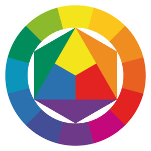
The colour wheel will tell you which colours go together and is incredibly simple to use.
Colours which are directly opposite each other are complimentary. Ever heard that ‘red and green should never be seen’? Well that’s nonsense. Red and green are opposite each other on the colour wheel and so are complimentary.
There is also such a thing as split-complimentary. These are colours that are either side of the complimentary colour. For example, let’s take green as the colour we want to find matches for. Red is opposite green and so is complimentary. Red-violet and red-orange are either side red which means that these are the split-complimentary. They go with green, but are not as bold as the complimentary red.
So you see, complimentary colours are a primary colour and a secondary or tertiary colour. Primary colours are usually too bold to go well together, but they do well as a split complimentary. You can use them, but do so carefully. Simple, right?